APP / UX / UI
Amped / Gibson
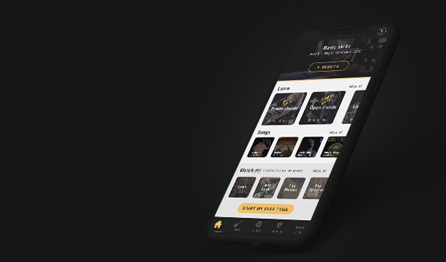
Amped is Gibson's guitar learning app that teaches users to play guitar through the use of augmented reality.
Tools
- Sketch
I was tasked with improving the home screen of the app with the following considerations:
- It should be clear to first-time users where to begin their learning journey, as this is the core feature.
- Returning users should easily be able to pick up where they left off.
I took full ownership of the project, creating use cases, onboarding flows, and user journeys. Additionally, I developed a new layout and design for the home screen.
THE RESULTThe outcome resulted in a significantly improved UX, with the new approach addressing all user needs. The redesigned home screen layout improved navigation, making it easier for users to find content. The client was thrilled with the new version.
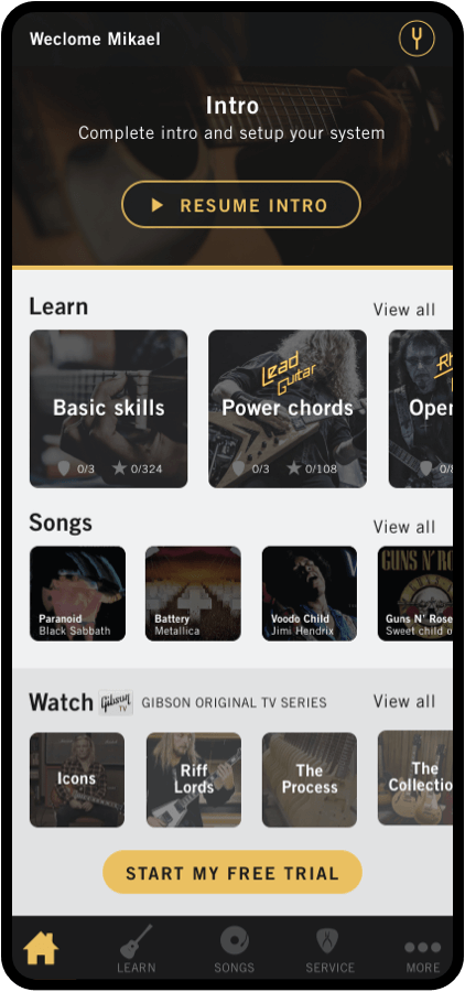
App Home screen
To the left, the previous version. Right, my updated UI

Use case 1
First time user
User partial completes onboarding

Load screen

Start onboarding
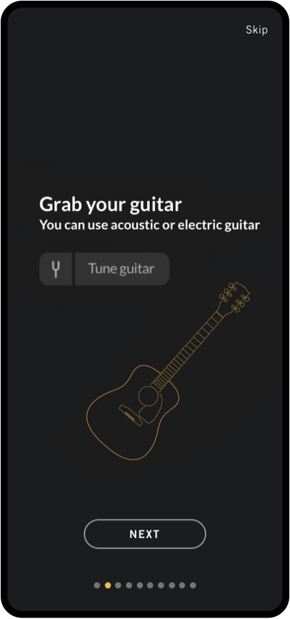
Onboarding
Introduction, the setup of system, tune of guitar and tutorial of the app

Updated home screen
Welcome messageGreeting current user
Progression sectionThe user has started the onboarding process and can easily resume where they left off
Learn sectionUser can swipe left to see more or View all which opens the learn page
Song sectionUser can swipe left to see more or View all which opens the songs page
Watch sectionUser can swipe left to see more or View all which opens the Watch page
NavbarThe categories have been arranged based on the assumption that these are the most frequently used. The "More" option opens a menu containing additional categories, including Shop, Settings, and Account
ScrollbarsAll content now fits within the view pane, allowing users to easily get an overview without the need to scroll
use case 2
FIRST TIME USER
User skips onboard

Load screen

Start onboarding
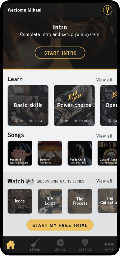
Updated home screen
Displays where the user left off last time. In this case the user has not started.
use case 3
Returning user
User can easily resume learning

Load screen
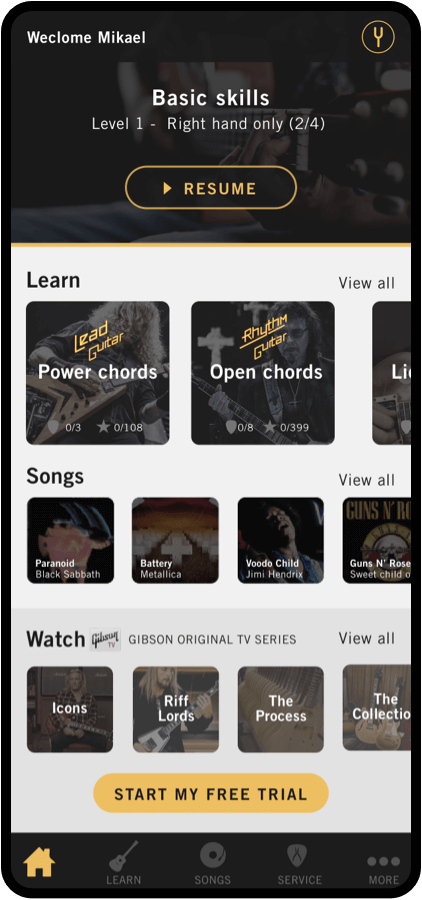
Updated home screen
Progression sectionUser has stared the learning and can easily resume where they left off
Learn sectionThe courses user has began or completed will disappear from this section