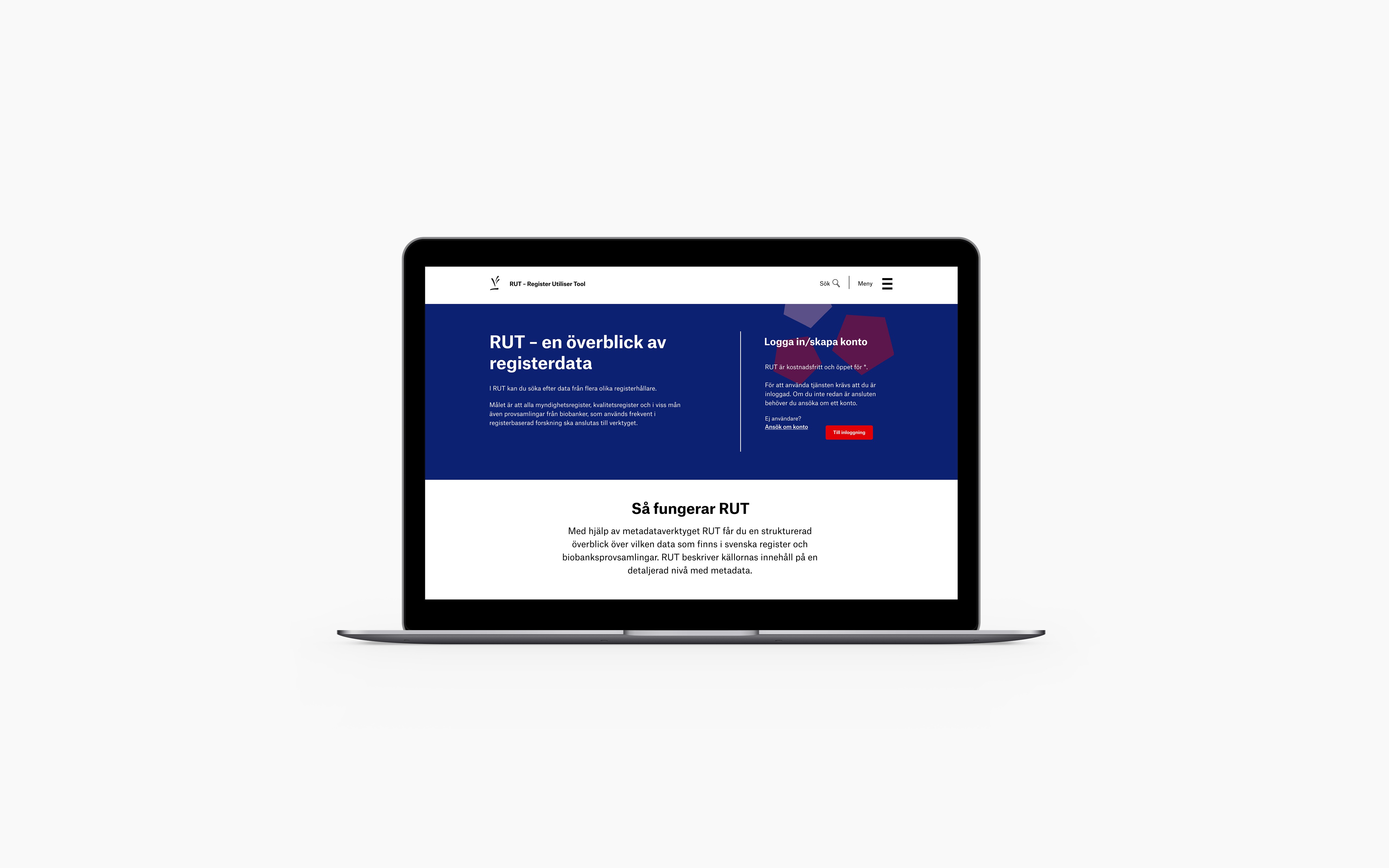
UX / UI
The Swedish Research Council
The Swedish Research Council is Sweden's largest governmental research funding organisation, supporting research across all scientific disciplines. To support register-based research, they offer a tool called RUT (Register Utiliser Tool), a web-based metadata platform that enables researchers to search and combine metadata from Swedish registers.
Tools
- Figma
THE PROJECT
Within RUT, researchers need to identify potential correlations between data across different registers, starting by comparing the overlap in time. Researchers should also be able to easily navigate through the list of registers and access relevant information.
MY ROLE
As the sole UX/UI designer I was responsible for the user journey and visual design.
THE RESULT
The result was a new feature within RUT that allows users to add registers for comparison and view a visual representation of their overlap in time. The updated design also improved navigation through the registers by providing relevant and adequate information on each page.
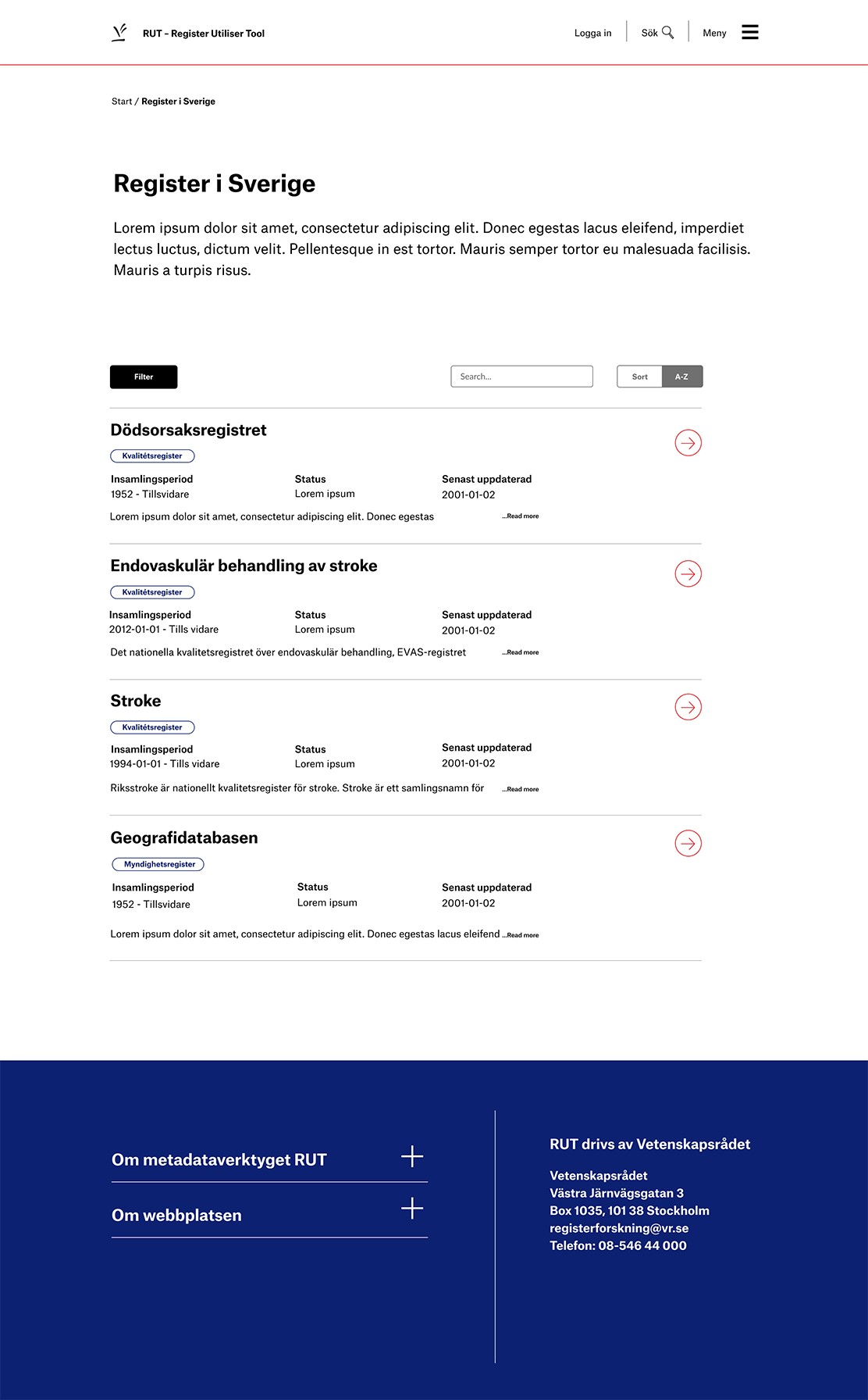
Register list view
An overview of the registers which are divided into sections. Clicking Read more expands for further info, whilst the arrow buttons open the register detail page.
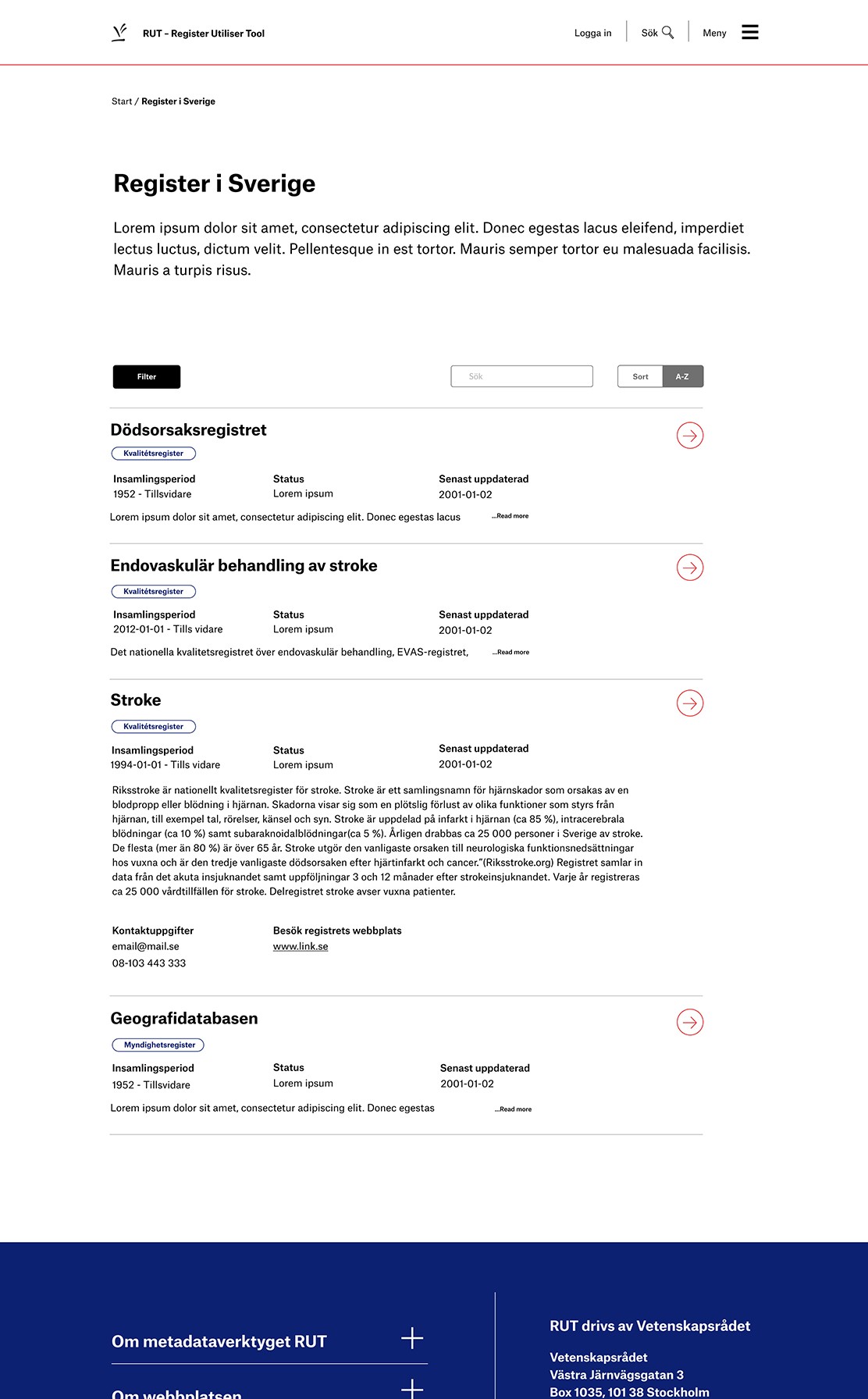
Register list view
The Stroke register has been expanded to provide users more information.
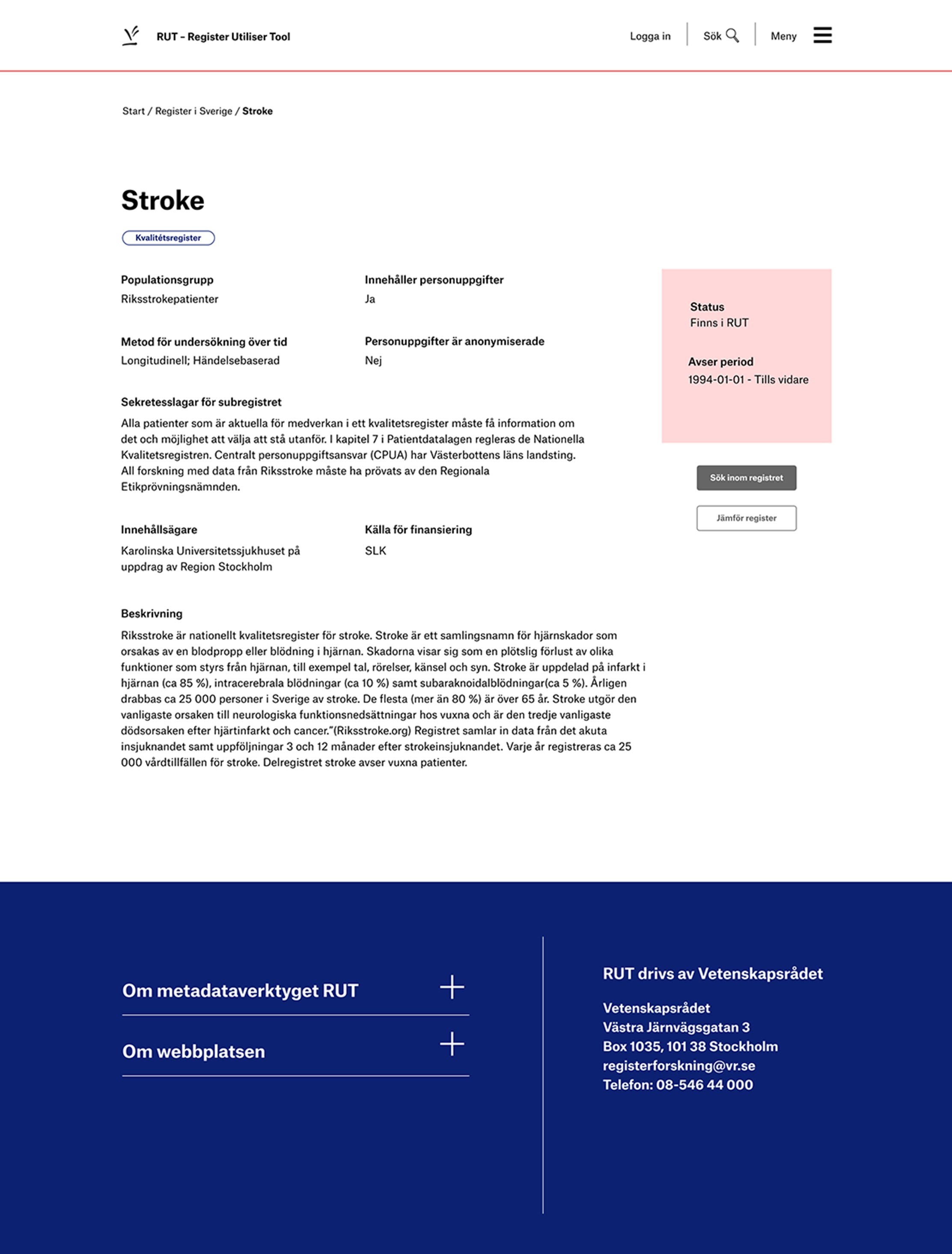
Register detail page
Full details of a register. Users can click “Jämför register” to add the register for comparison.
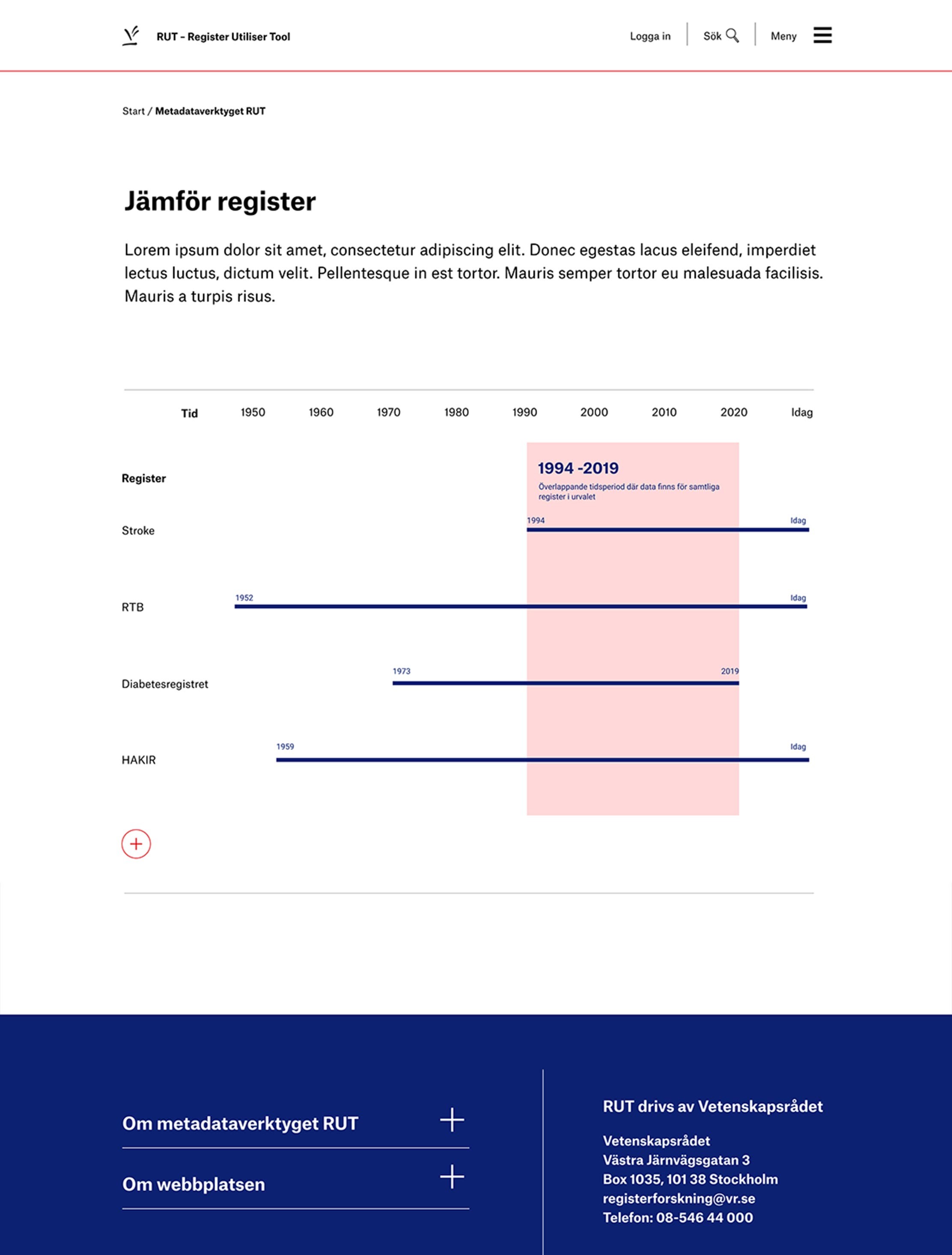
Compare register page
A visual timeline overview displaying the duration of the registers, providing an essential feature for researchers seeking to identify correlations between them. Users are also able to add registers (+) for comparison.
